
Project 42
Web Design
/
/
Project 42 is a film-inspired web experience that treats big existential questions with the humor they deserve.
Imagining a fictional research group born from The Hitchhiker’s Guide to the Galaxy, the site builds a self-contained world – part scientific, part playful – where a 3D research map, visuals and micro-interactions invite users to navigate questions and possible answers as an ongoing search rather than a final conclusion.

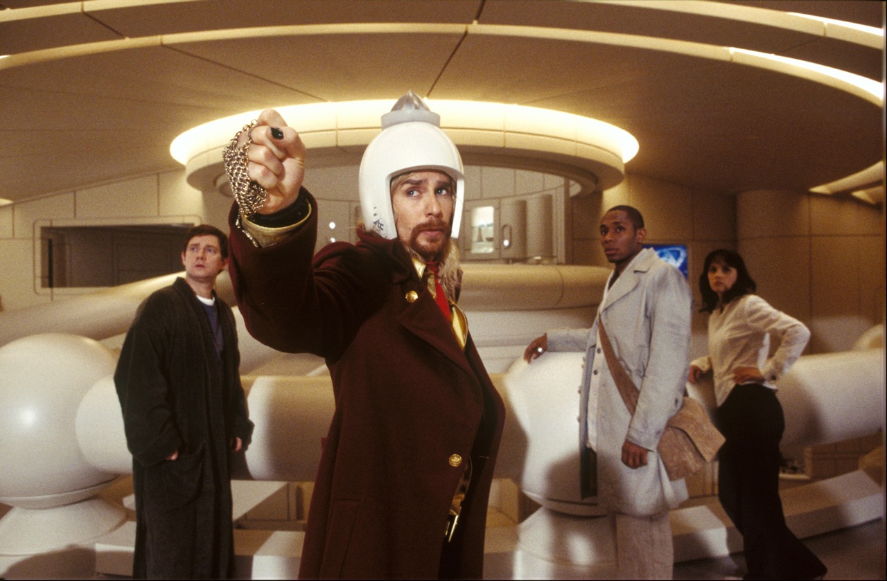
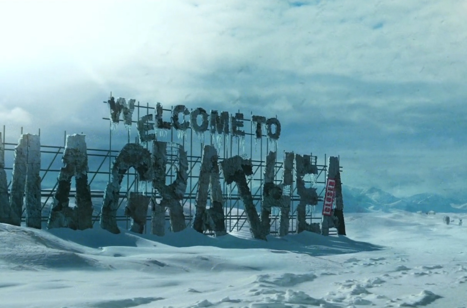
The Hitchhiker's Guide to the Galaxy is a science fiction comedy film based on the book series of the same name. In the film, Arthur Dent, an ordinary Englishman, finds himself escaping Earth just moments before its destruction by the Vogons, a bureaucratic and emotionless alien race. He joins his friend Ford Perfect, an alien who has been posing as a human for 15 years while gathering information for the "Hitchhiker's Guide to the Galaxy", a guidebook for intergalactic hitchhikers.
Research
Grounding a Fictional World in Real Research and Real Users.
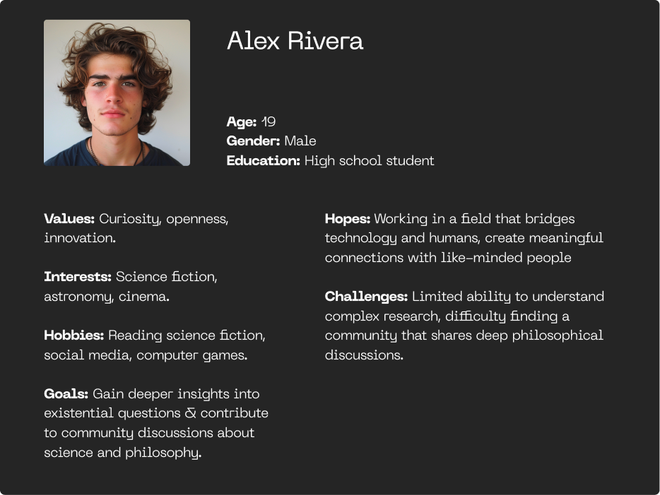
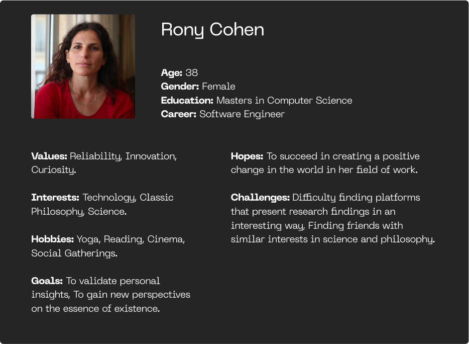
The research process involved extensive research on the film and its story, visiting and analyzing websites for modern science/tech initiatives, and developing two personas that felt relevant to the concept of the site. Each persona represented an edge case.
Concept
Designing a world where analytical structure meets playful exploration.
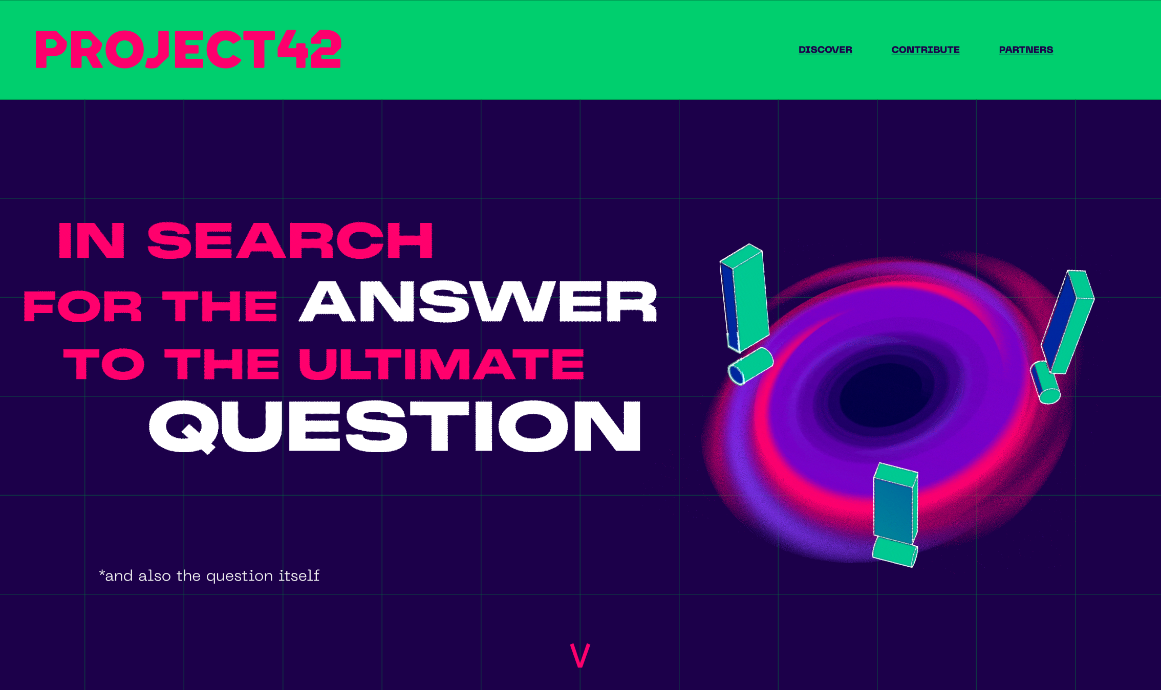
I wanted to connect the fictional world of the film with our own reality. That led me to imagine a research group called Project42 — a team of philosophers and scientists searching for the ultimate existential questions and their possible answers.
As the concept developed, I realized that the real essence of these questions lies not only in the answers, but in the search itself.
I aimed to design a website and experience that hint at scientific and analytical worlds while still embracing the curiosity, exploration, and sense of adventure found in these philosophical questions — as well as the fun and colorfulness of the film.
UX Goals
Building clarity into a deliberately strange world.
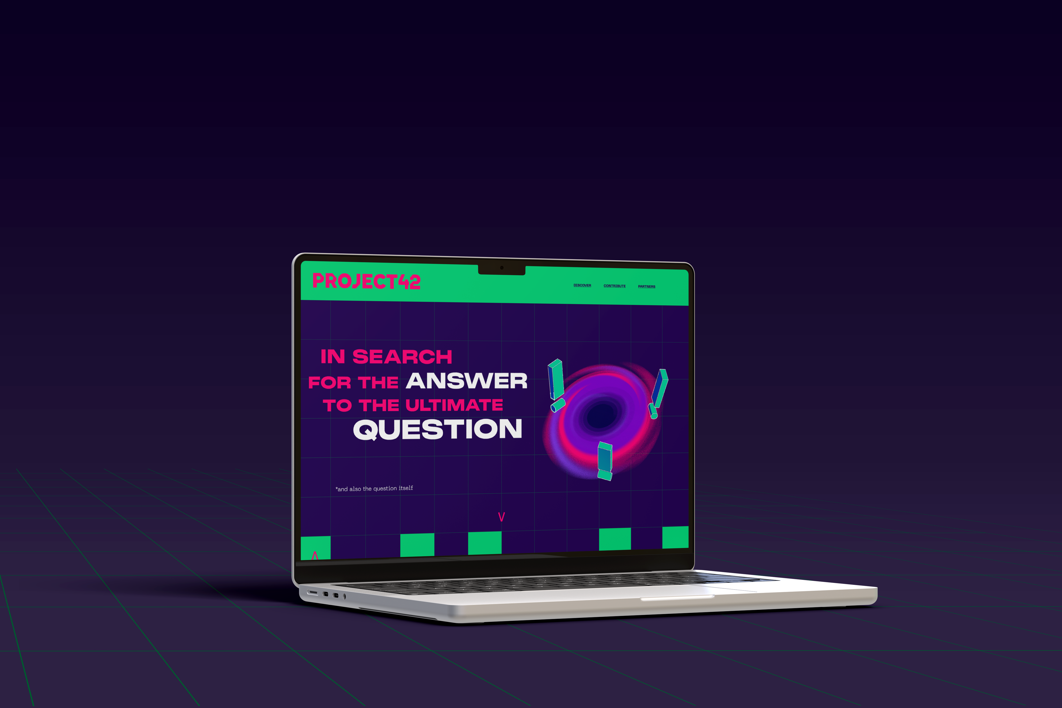
The goal was not just to design a website, but to create a world with its own logic and tone.
Narrative micro-interactions
A custom loader that stops at 42%, playful form-field references (e.g., “Arthur Dent,” “Vogons”), and subtle Easter eggs reinforce the project’s personality.
Bold visuals
A saturated palette and unconventional layouts help establish a memorable, distinctly non-academic atmosphere inspired by the film’s aesthetic.
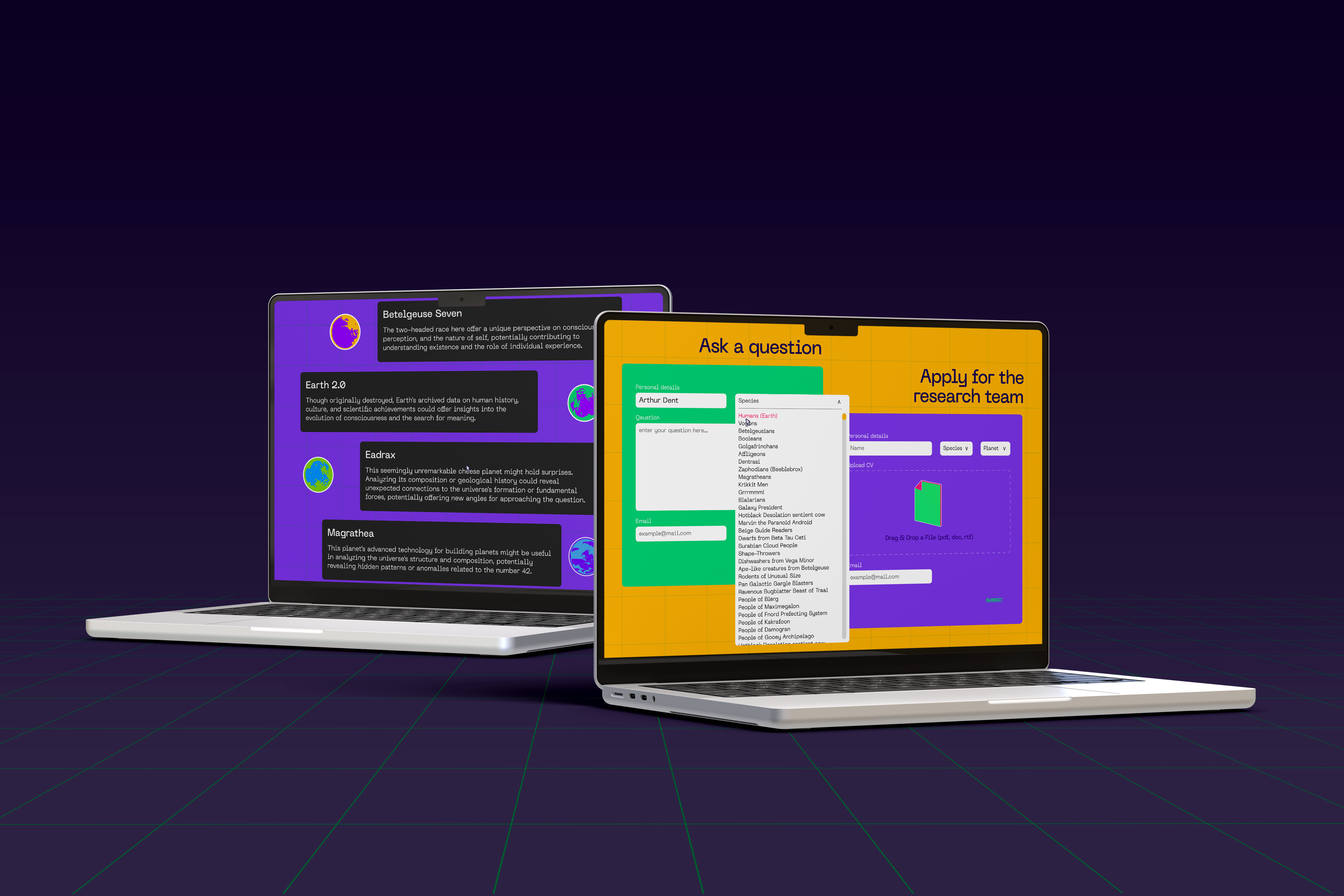
Simplifying a Complex Core Interaction
The 3D Research Map is the project’s most challenging feature, so accessibility and clarity guided every decision.
Guided onboarding
A short, mandatory tutorial introduces key interactions (zoom, pan, hover, click) before users enter the map.
Two-tier interaction model
Hover reveals the question (low-effort preview).
Click opens a possible answer (high-intent exploration).
This structure reduces cognitive load and supports confident navigation.
Design
Using type, color, and broken grids to signal a world that’s analytical but not too serious.
Typography & Color
I chose typefaces that subtly reference science, space, and technology.
I used typography in a way that intentionally breaks the expected grid, creating a sense of dynamism — type that feels as if it is floating across the layout.
The color palette draws inspiration directly from the film’s visual style: rich, saturated, and energetic.
Unlike the cold, serious aesthetic of many academic or scientific websites, I wanted to create a world that feels vibrant and playful — something that signals that this isn’t a typical research project.
Icons & Graphic Elements
3D-inspired forms with flat shading, A play between motion and depth against a flat, structured grid, “Broken” typography and frames to create visual tension between the precise scientific grid and the playful, adventurous tone of the film and the fictional research group.
Layout
Juxtaposes a straight grid (science, precision) with misaligned elements (playfulness) to create visual tension.

.png)
.png)
.png)
.png)
.png)
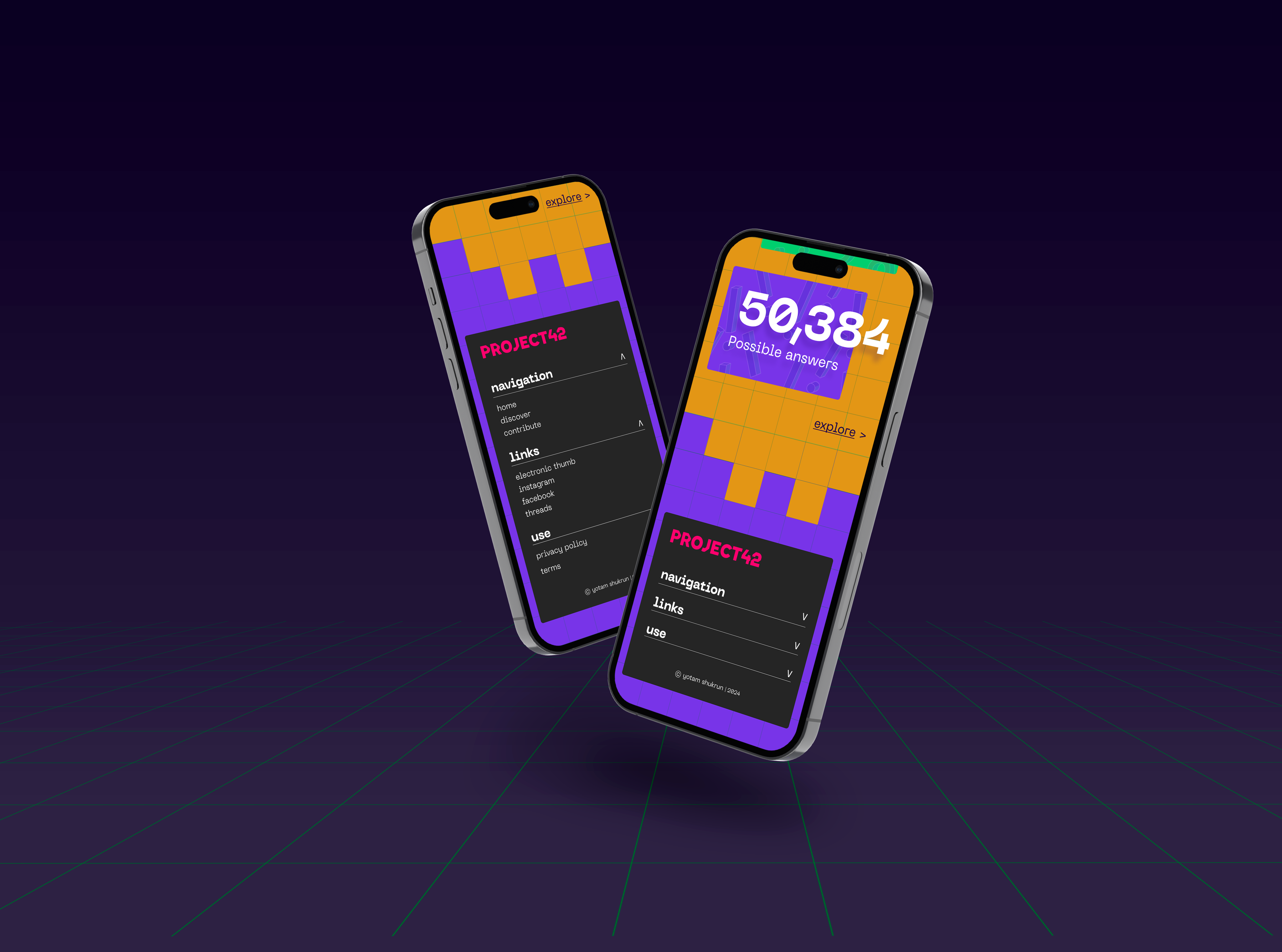
Responsive Design
Designing for every device.
Responsive layout with adjusted design elements for support on mobile devices — Logo, navigation (desktop: navbar vs. mobile: sidebar/menu), sections, and graphic elements.


Project 42 is a film-inspired web experience that treats big existential questions with the humor they deserve.
Imagining a fictional research group born from The Hitchhiker’s Guide to the Galaxy, the site builds a self-contained world – part scientific, part playful – where a 3D research map, visuals and micro-interactions invite users to navigate questions and possible answers as an ongoing search rather than a final conclusion.
