

SPICED
Branding
/
Motion Design
/
SPICED shows how strategic branding can turn a simple idea into a craveable lifestyle product.
Through market and competitor research, I positioned an alcoholic ice-pop as a bold, natural alternative to “classy” or “sporty” alcohol brands. From naming and slogan to visual identity, packaging and motion, SPICED builds a brand that feels edgy, handcrafted and young — giving it a clear voice, a distinct shelf presence, and a story people actually want to drink.
I came up with the idea for an alcoholic ice-pop, nothing revolutionary or novel, but, after market research I came up with the right positioning for it, which led to the selection of the name, logo, brand slogan, positioning statement and a fitting visual identity.
SPICED - More than ice-pop, more than a cocktail.
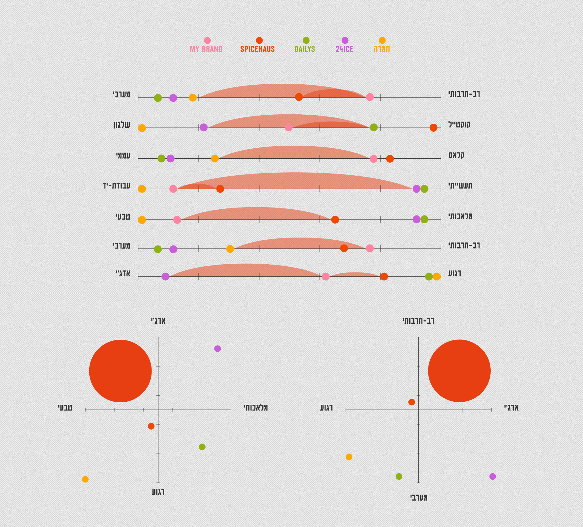
Strategy & Positioning
Finding the White Space
in a Crowded Drinks Market.
The first step was to analyze competition and their brand positioning, strengths, USP'S and values. The process helped decide what is the best position for my brand.

Brand Values
Defining a Personality People Want to Drink With.
Finding the right positioning helped determine which of the brands values are worth leaning towards.
Edgy
We’re not afraid to push the boundaries — that’s where the special, interesting, and new things happen.
Natural
We use only the highest-quality natural ingredients, no compromises. Nature does the work; the only thing we add is real alcohol.
Fusion
Flavors crafted from the best the world has to offer. We believe in a global world and in blending cultures — that’s what makes things exciting.
Craft
By making everything ourselves, we stay closest to the product and ensure you always get more.
Innovative
We believe in creating new experiences — alcoholic popsicles and out-of-this-world flavors.
Design Concept
Making Edgy and Natural Feel Cohesive and Ownable.
The design concept was Edgy, crafty, young.
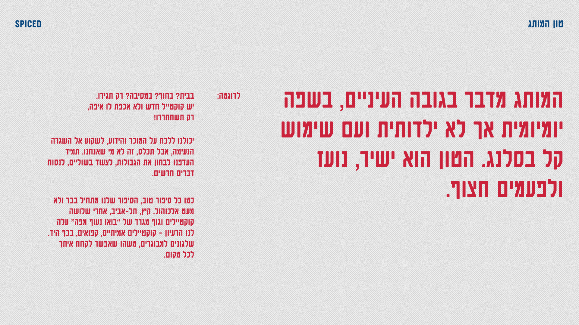
Leaning away from other brands identities which were either "classy" or "sporty", SPICED identity was to be edgy, brave, unapologetic — bold colors, bold typography and hand drawn elements, bringing out the craft, the youth and fun of the brand.

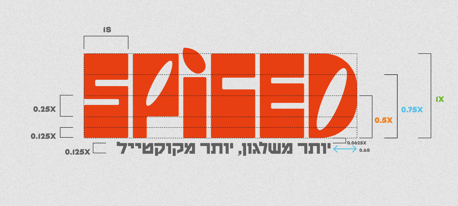
Naming & Logo
Telling the Whole Story in a Single Word and Mark.
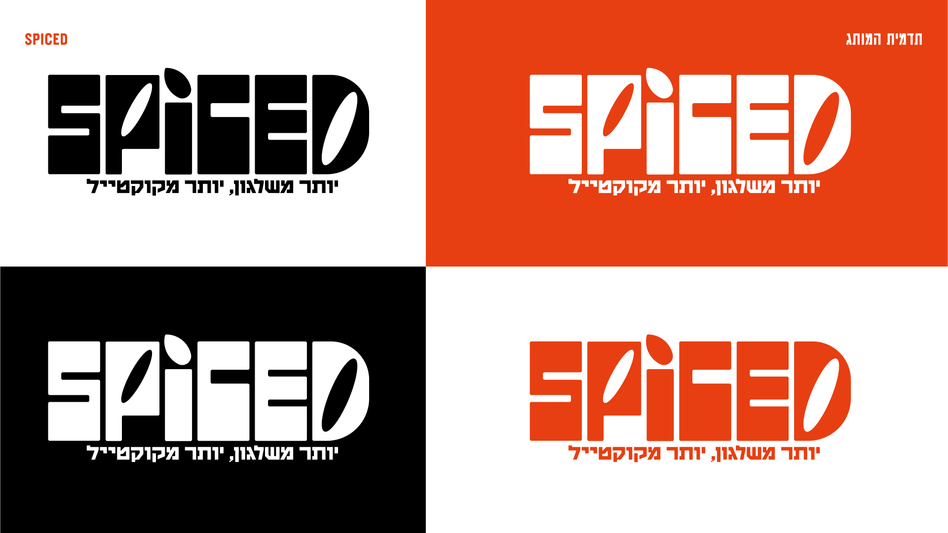
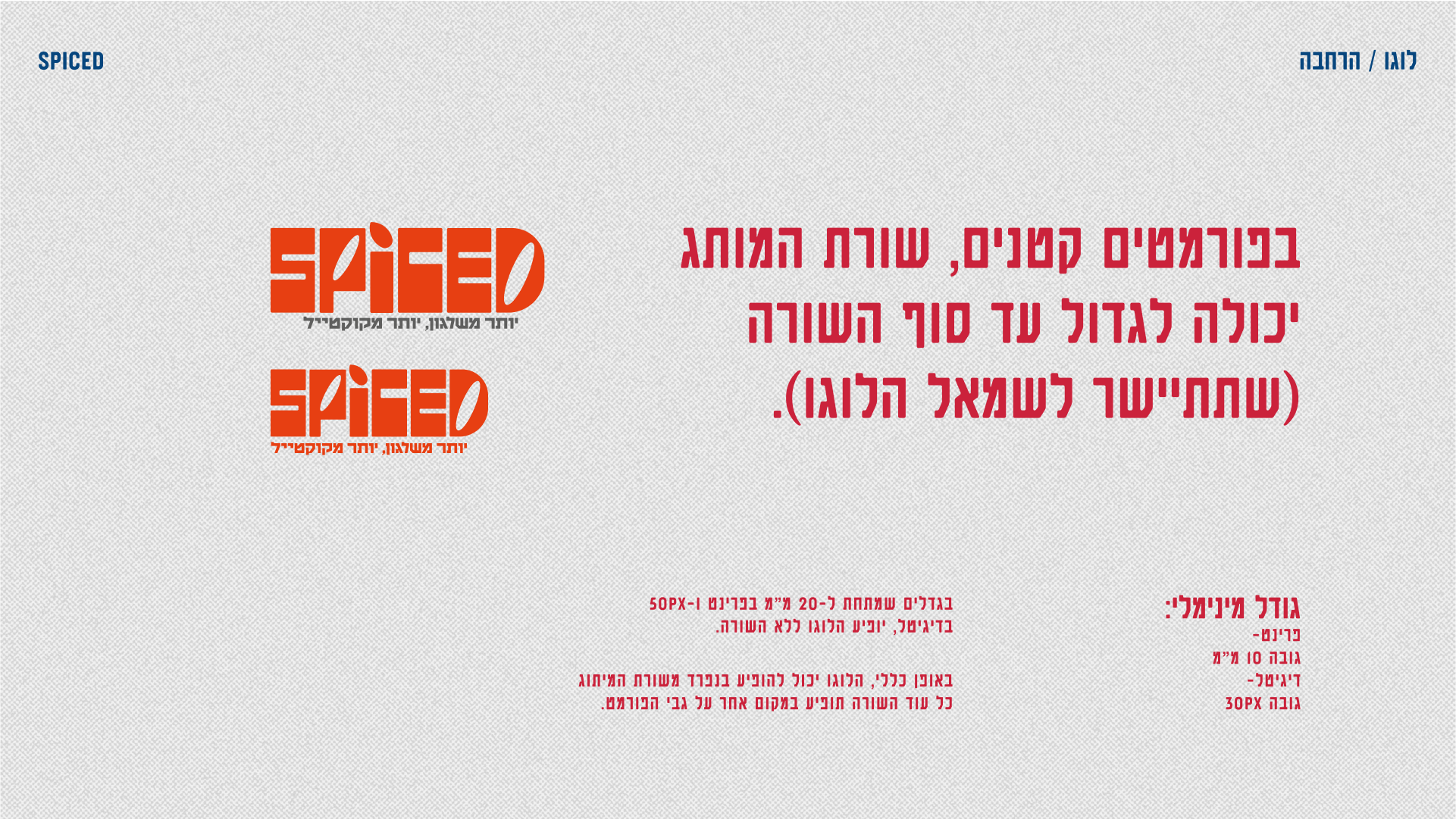
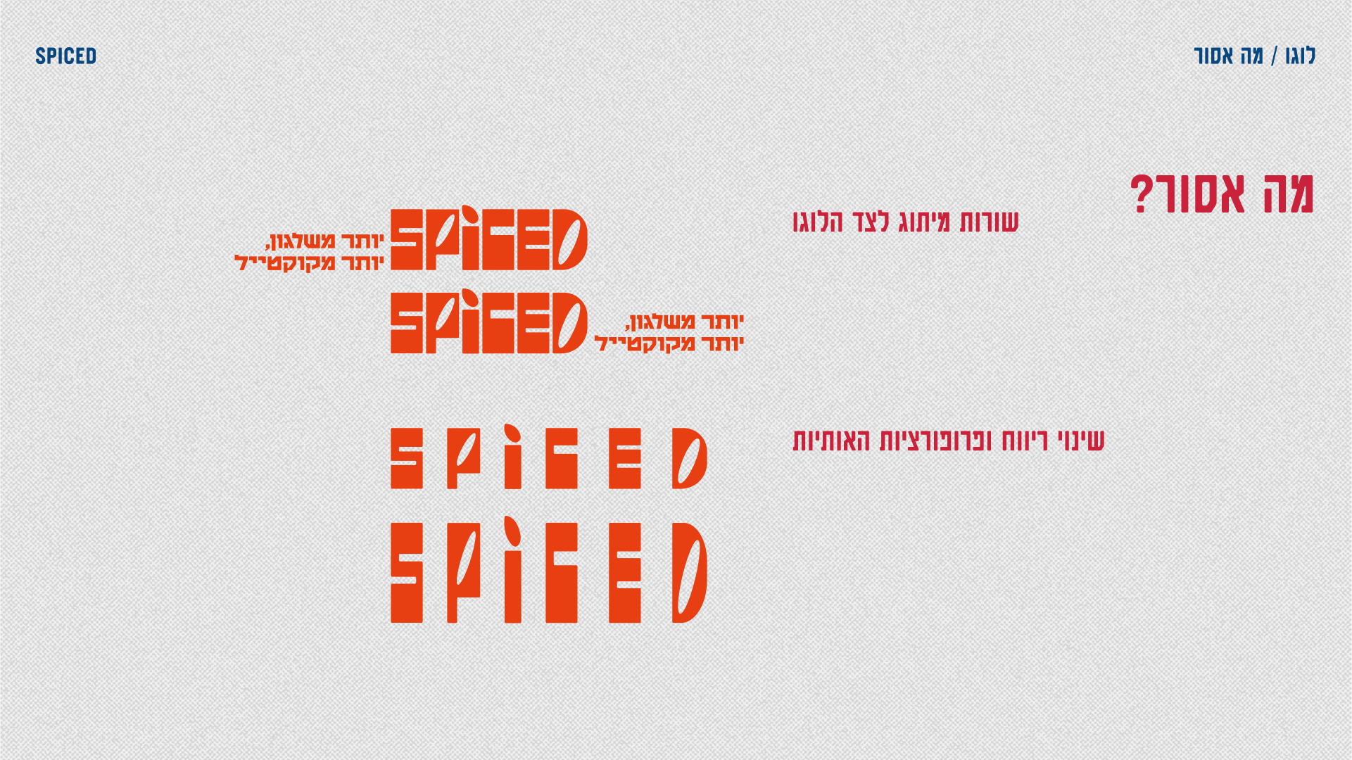
The name I decided on was a play on the double meaning of "Spiced" as in spices, but also "Spiced" as in under the influence, combining in the name both a USP and a brand value. The logo itself is based on hand-drawn letters, with a bold "in your face" presence.
Below are some early names and sketches that were eliminated.
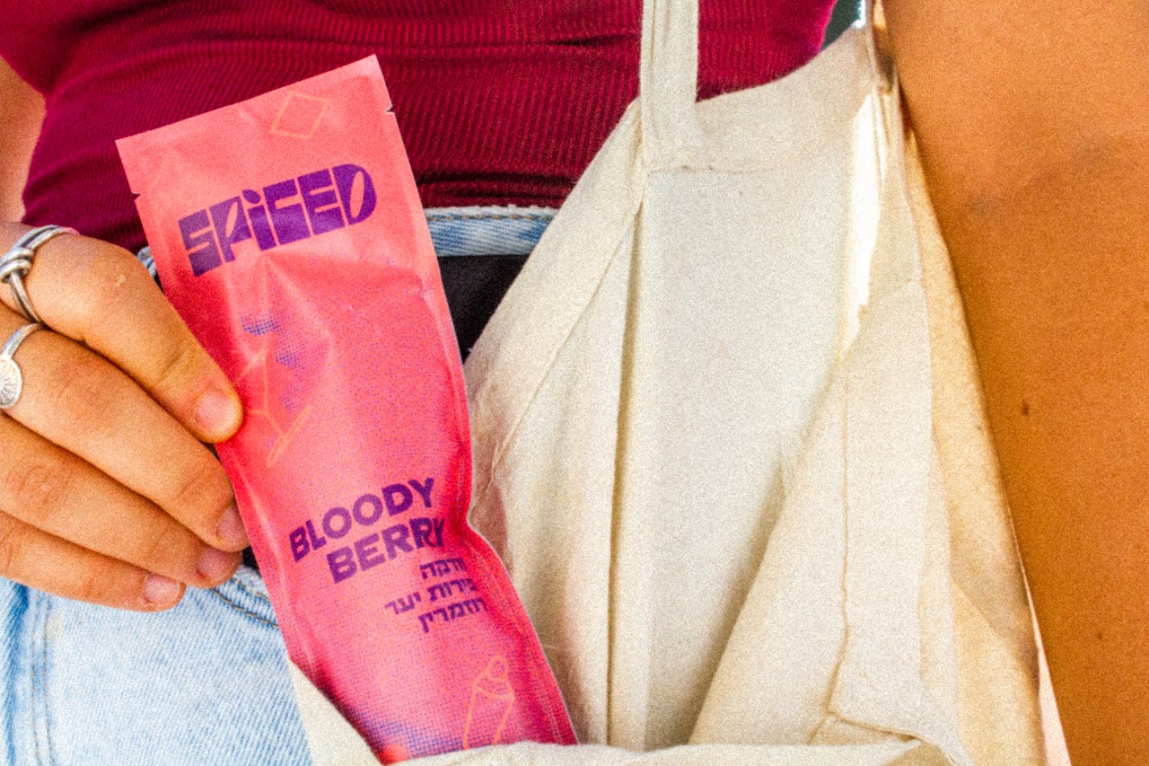
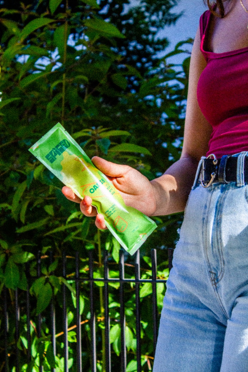
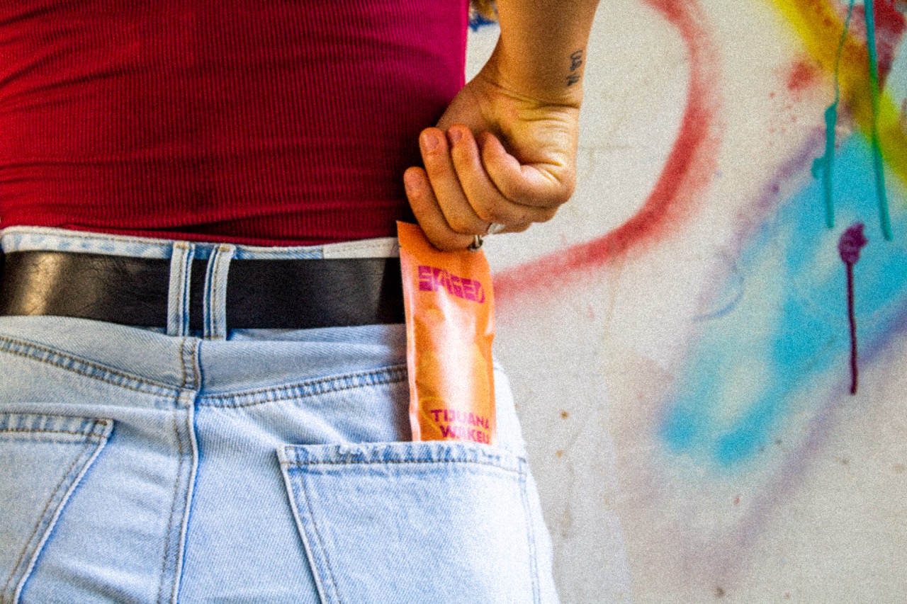
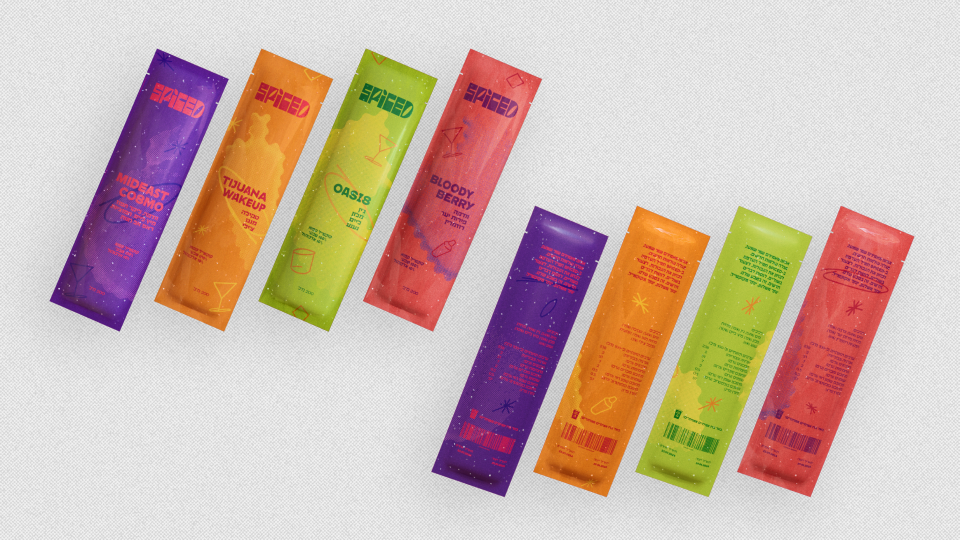
Packaging Design
Turning Shelf Visibility into Instant Craving.
The package design was aimed at being visually striking, with bold colors and contrasting color palettes both within each individual package and between each unique flavor. Combining abstract shapes and hand drawn scribbles, giving off a laid-back, young and free spirited vibe, together with coherent, clear typography, creating the balance of "we're free, bold, and fun, but we know our craft".


SPICED shows how strategic branding can turn a simple idea into a craveable lifestyle product.
Through market and competitor research, I positioned an alcoholic ice-pop as a bold, natural alternative to “classy” or “sporty” alcohol brands. From naming and slogan to visual identity, packaging and motion, SPICED builds a brand that feels edgy, handcrafted and young — giving it a clear voice, a distinct shelf presence, and a story people actually want to drink.